Showing posts with label typography. Show all posts

Monday, December 22, 2008

Everything at once


Ah, internet, how fickle you can be. Due to the lack of internet connection at my house, I have had to rely on the library, but am generally too busy or snowed in to make the trip. So, there's fewer updates than I'd like. I've been a busy bee, making christmas presents for the family. Being flat broke brings out the crafty side of me. Well, the fact that the last weeks of school were spent staring at a computer screen also gave me cravings to just make things with my hands. Here, though, is what I did the last weeks of school, starting with the rest of my intaglio final:


The devil and angel in color, which I then used for the multiplate piece in the previous post:

Basically, I was playing with the idea of the "characters" who control our fate being trapped and no longer in control of their fate. I bound them into a little booklet, which I will probably improve when I take bookbinding next semester.

I finally finished my tea kettle that I'd mentioned weeks ago. I decided to do a glass/metal fusion:


I love how blogger changed the background colors to a putrid green. Ah well.

Finally, my type class did a bus wrap project for the Connective Corridor and Centro. The Post Standard reported on it here.

Oh my! I have to run and finish my Christmas shopping and making! Hopefully more updates after the holiday!

Sunday, November 2, 2008

Type Poster

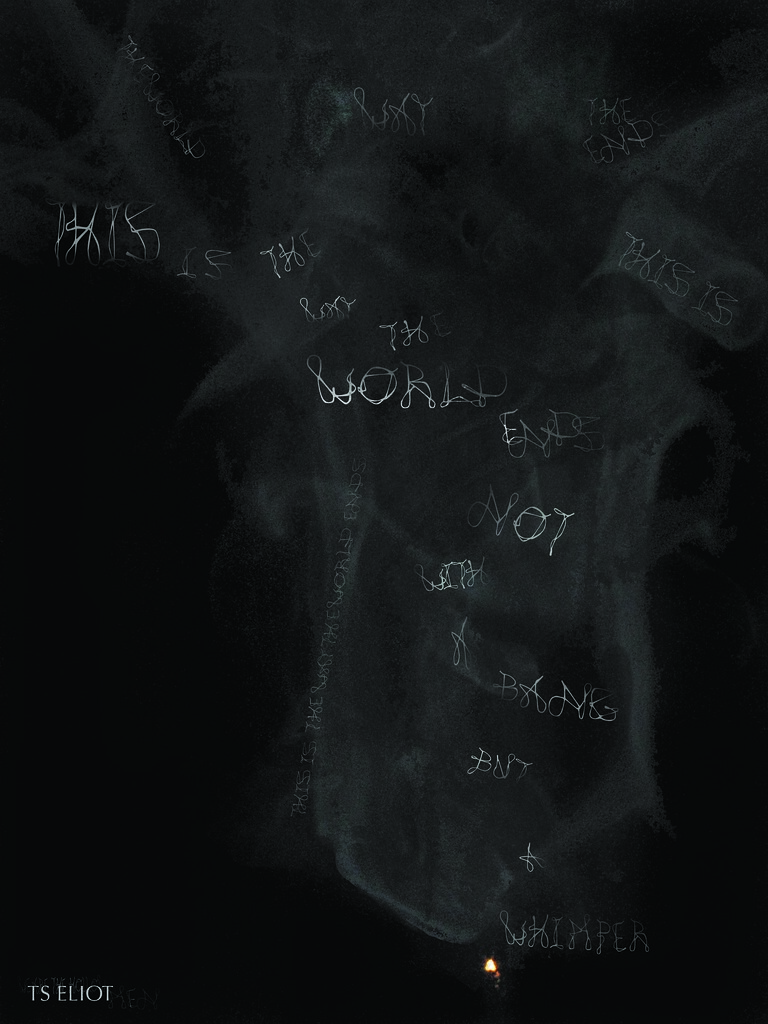
smoke poster

From the TS Eliot poem "The Hollow Men." Larger version here.

Poem lines:
"This is the way the world ends
This is the way the world ends
Not with a bang but a wimper."

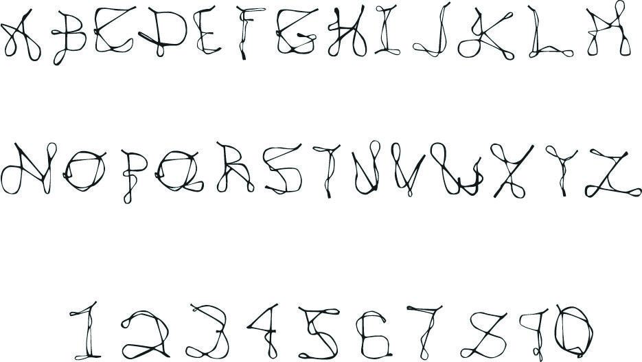
The finished typeface:

rubber band type

Sorry it's so small, but it took ages to even get blogger to post this. Apparently it doesn't like JPEGS saved from Adobe. Larger version here.

Monday, October 20, 2008

What Happens When I Forget an Eraser and Am Too Lazy To Find One...

Just sketching out my idea for Intaglio, sans eraser, which is a must in my world. I ended up tracing the good parts on the light table. I really like her legs. Will scan the finished product next week, and hopefully my other two, once my prof returns them.


Doodling during class tonight. I'm really liking the two-tone mix. I'll need to buy some more staedtler triplus markers soon.
Type is coming along slowly. I'm really digging these three letters, but the rest need a lot of work. We're making posters from them, printed off the department's new plotter. Of course, hanging in the print studio has made me think in printing press terms, which might not turn out as well via a plotter.

Friday, October 3, 2008

Type is life


Current project for my typography class: make a minimally legible, undecorative (ie-"cutesy") typeface. I always feel the need to make everything three-dimensional first. My best letters so far:


I didn't realize it until later, but the A kind of looks like the Adobe reader logo:

Ah well, paying subconscious homage to the company that designers owe so much to (though, apparently CS4 doesn't have a release date? and some of their commands are counter-intuitive.)

More when the font is completely digital and tweaked to (near) perfection. Very excited about this project, as we get to make a 30'x40' foot poster on the school's new plotter.